Packaging once did more than hold a product—it shaped expectations. Labels flashed with promises, designs whispered convenience, and brands leaned into whatever caught the eye. What seemed clever or harmless then now reads differently under modern rules. Let’s look at the designs that went a step too far.
Campbell’s Soup And Heart Symbols
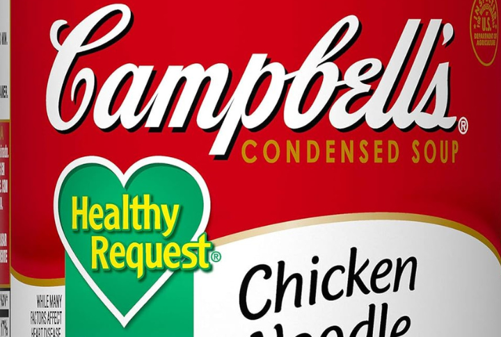
Some Campbell’s soup cans used heart icons to hint at health perks, even when sodium levels ran high. The average shopper might take the design as a seal of approval. Back then, it passed. However, now, anything that suggests a health benefit needs evidence and tighter compliance with labeling laws.
Windex’s Natural Look Hid A Harsher Reality

With leafy labels and “non-hazardous” claims, Windex Nature’s Source gave shoppers the impression of a safe, green cleaner, appealing to eco-conscious consumers. It still contained synthetic ingredients, but the branding went unchallenged for years.
Aqua Net’s Ultimate Hold With Hidden Hazards
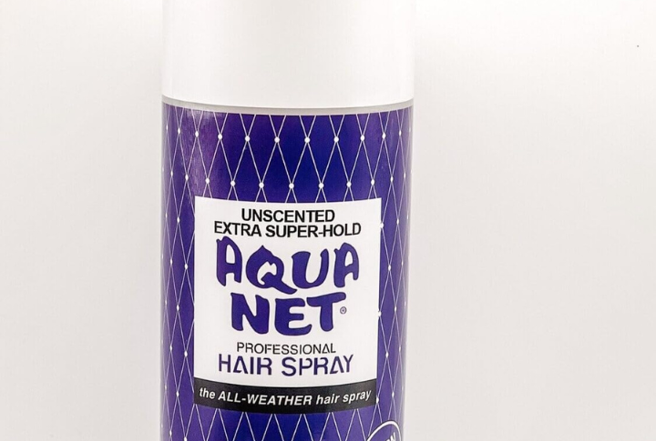
Labels now must list chemicals, especially those linked to health risks. That wasn’t the case when Aqua Net promised “ultimate hold” with a sleek, no-nonsense can. Harsh solvents and propellants filled the formula, but the packaging stayed quiet.
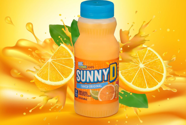
Sunny Delight’s Juice Deception
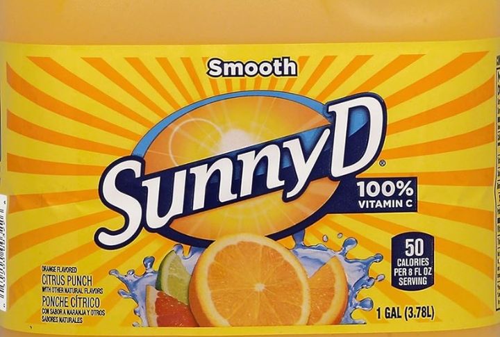
Modern rules demand that packaging reflect what’s inside, especially fruit drinks. Years ago, Sunny Delight sat beside orange juice in stores, covered in cheerful citrus images. The label suggested fresh fruit content. However, the drink was mainly water, sweeteners, and additives, with very little juice involved.
Lucky Charms And The Healthy Halo Effect
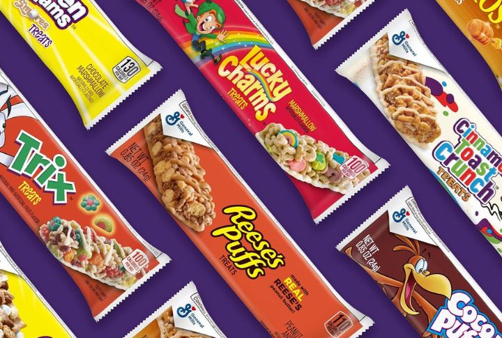
The health halo effect makes foods seem healthier than they are. Lucky Charms, with its colorful marshmallows, was marketed as “wholesome” due to its oat content. Clever packaging and wording reassured parents, masking its high sugar levels.
Sunkist Orange Soda’s Fruit-filled Labeling
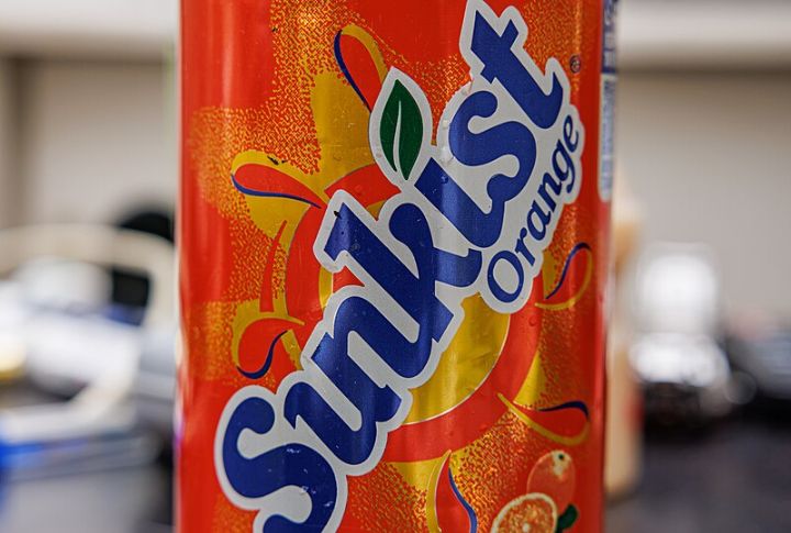
Bright labels and a trusted citrus name gave Sunkist the impression it came directly from the grove. Orange imagery helped sell the idea of real juice. It was soda, packed with sugar and artificial flavors, with no real fruit.
Ayds Diet Candy’s Illusion Of Effortless Weight Loss

For decades, Ayds’ appetite-suppressant candy claimed to help users slim down without diet or exercise. The name aged poorly, but the bigger issue was the packaging—glamorous promises with no clinical proof. Despite early FTC warnings, it kept selling.
Wrigley’s Spearmint Gum And The Tooth-friendly Promise
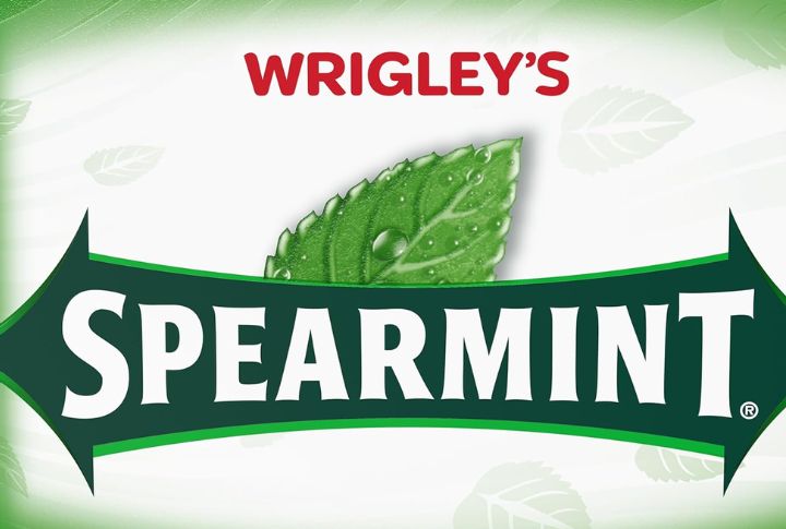
Any product advertised as “good for teeth” now faces strict review. Decades ago, Wrigley’s gum made that claim on sugary formulas, using fresh flavor and sleek packaging to imply oral benefits. No one questioned it—until health experts started looking at what sugar did.
Kool-Aid’s Natural Flavor Trick
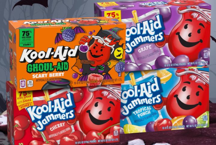
Kool-Aid’s use of “natural flavor” on packets misled consumers despite containing artificial dyes and lab-made flavors. Labeling laws now require clear standards for such terms to prevent confusion, but for years, many assumed the label matched the product.
Post Toasties And The Secret Of Youth Claim

Early Post Toasties packaging once promoted the cereal as the “Secret of Youth.” The flakes came from milled corn and sugar, but the bold claim hinted at anti-aging benefits. That kind of language slipped by authorities back then.
Leave a comment